
- /
- /
- /
- /
Card Anatomy
Cards are the units of Wowzers by which you plan and execute your growth strategy. Team members populate cards with the information they need to capture ideas and document and deliver initiatives.
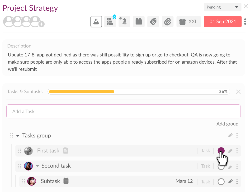
Card Container.
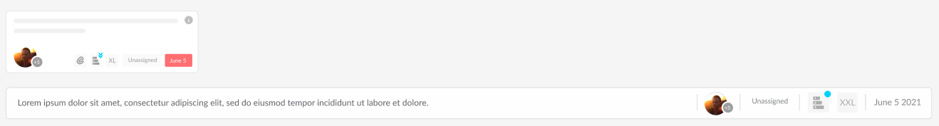
The card container relays high-level information about the card, including:
- Card Title
- Card Due Date
- Assigned Team Members
- Card Status
- Card T-shirt Size
- Attachments
- PHIEs Score
To open a card, double-click the card container. You can select single or multiple cards by left-clicking the card and holding down the control key (CTRL). Once selected, filter, move, decline or delete cards via the board toolbar.
Card Header.
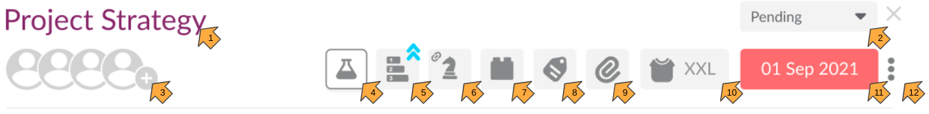
Comprising a title, date picker and multiple icons, the card header serves as the card control panel. Key features:
| # | Name | Description |
| 1 | Title | A short, user-defined headline capturing the essence of your card. It helps differentiate the card from others on a Workflow board |
| 2 | Status | The stage a card is at in a workflow. Updated automatically based on the card’s position in Kanban view. |
| 3 | Add Team Member | Add team members to a card. |
| 4 | Experiment | Load the blocks associated with each card design. |
| 5 | Priority | Convey the relative importance of one card over another by assigning it one of five priorities: Highest, High, Medium, Low, Lowest. |
| 6 | OKRs | Only visible if this card is an initiative on a Key Result. |
| 7 | Card Blocks | Customise card functionality with blocks. Some blocks are unique to experiment card templates. |
| 8 | Define Properties | Categorise cards with properties. Pick from system-defined properties (e.g. ‘AAARRRR’ Framework) or create your own. |
| 9 | Attach Files, Links and Cards | Upload attachments, affix links or connect to other cards. |
| 10 | Assign T-shirt Size | Estimate the duration of a duck soup or experiment with T-Shirt sizes. |
| 11 | Card Due Date | Specifies the date a card is due. The card due date highlights when a card is due in < 3 days. |
| 12 | Card Actions | Actions provide several options relating to card workflow, including ‘‘Move Card’, ‘Decline Card’ or ‘Delete Card’. |
Card Blocks.
Blocks let you enter, edit and store information on cards. Each block serves a specific purpose; for example, the Attachment block ensures you can upload documents and images, add URLs and connect cards.
Some blocks load by default, while others are optional. With the exception of the Description block, all blocks can be removed. As such, blocks provide cards with a degree of customisation.
For more information on blocks, read this article: Blocks.